Join 379 other subscribers
Great Quotes:
"My mission in life is not merely to survive, but to thrive; and to do so with some passion, some compassion, some humor, and some style."
- Maya Angelou
Recent Comments
- Chanak on This is Zambia!
- Rob Martin on Being bilingual!
- Donghee lee on Being bilingual!
- tommy on M.S. Spirit Week
- Yunwoo Ra on December Birthdays
Class Resources
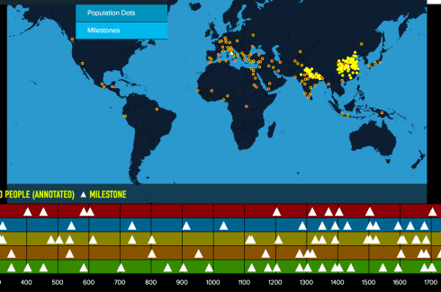
 Out of Eden Walk
- An error has occurred; the feed is probably down. Try again later.
Early Humans
Mesopotamia
Ancient Egypt
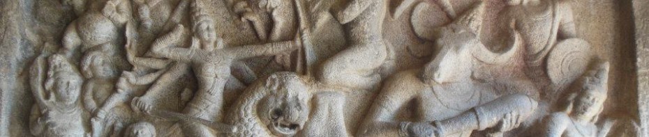
Ancient India
Ancient China
Ancient Greece
Archives
Categories
Tags
40 Book Challenge Achievements Active Reading Advisory Africa AISC News & Events Ancient Monuments Archaeology Artifacts Assessments Author of the Month Ayyanar Horse Project Birthdays Blabberize Blogging Book Reviews Book Trailer Book Week BriarHill24hrWorldTour BYOT Calming Sounds Cartoons Caste System Character Traits Chennai Civilization Traits Class Connection Climate Code of Hammurabi Conflict CoronaVirus Culture Cuneiform Distance Learning Documentary Dot Day E-Books E-Portfolio EAL Earth Day Economy Farming Friday Fun Stuff Geography Globalization Government GRAPES Great Books Heart Map Hello and Goodbye Horrible Histories Humor Ice Man Immigration India Week Infographic Inquiry Kahoot Language Languages Law Literacy Locks and Lockers Map Reading Skills Maps Memoir Migration Milestone MovingOn Mummies Museums Music Nepal News Articles Out of Eden Learn Out of Eden Walk Peace Day Photography Plot Elements Podcasts Poetry Poll Question Poverty Primary & Secondary Sources Projects Project Xpat Proverbs Punctuation Pyramids Quotes Raptor Reader Refugee Religion Research Tools RISE Service/Service Learning Silk Road Snapshot Autobiography Song Spirit Week Summer Fun Tagxedo TedTalks/Ted-Ed Thesis Statement Travel UN Day Vacation Video Visible Thinking Visiting Author Vocabulary War Water Week Without Walls Welcome World Wide Wilbur Yelagiri Zambia ZaptionVisitors since 9/27/13
Teacher Resources
- 50 Useful Links for Teaching & Learning English
- Ancient History Encyclopedia
- Ancient History Wikipedia
- Ancient/Classical History @About.com
- Best of History Links
- CMS Curriculum Companion
- Current Events Links
- Cybrary Man's Links
- Discovery Education Puzzlemaker
- EdWorld Current Events
- Fall of Civilizations Podcast
- History Channel
- Khan Academy
- OLOGY American Museum of Natural History
- Pulitzer Center Education
- Teaching with Documents
- Tom Richey's S.S. Resources
- Visible Thinking (Project Zero)

This work is licensed under a Creative Commons Attribution-NonCommercial-ShareAlike 4.0 International License.

Leave a comment